
And Then There were None Movie Poster
Designed this movie poster and logo for the Black and White Film Festival. The Book is “And Then There Were None” by Agatha Christie. Chose this film because the original book was a gripping thriller. The story follows ten strangers invited to a remote island for a lavish party, only for the event to take a dark and deadly turn. The design aims to capture the mystery and suspense of the story while maintaining a sense of elegance.

And Then There Were None Movie Social Media Ad
Social Media Poster & Logo
Created for the Black and White Film Festival, this campaign promotes Agatha Christie’s And Then There Were None, a suspenseful thriller about ten strangers isolated on an island. The design captures the story’s tension and mystery through bold, minimalist visuals that reflect the festival’s black-and-white aesthetic.
Black And White Film Festival Logo
This logo was designed for the Black and White Film Festival, featuring a cartoonish style that reflects the unique blend of sophistication and humor found in black and white films of that era. While these films often carried a sense of elegance and refinement, many also embraced a playful, comedic tone, which I aimed to capture in the logo design.

The Wolfman
This illustration reimagining of The Wolfman captures the eerie essence of classic horror with a bold, modernized visual approach. Inspired by vintage movie posters, I crafted this piece with dramatic lighting, rich textures, and dynamic composition to evoke a sense of suspense and intrigue. The illustration emphasizes the haunting transformation of the Wolfman, blending traditional horror aesthetics with a contemporary graphic style.
This work showcases my ability to interpret cinematic themes through illustration, utilizing strong composition, color theory, and typography to create an engaging and visually striking design.

Colorado Composition
As an artist assistant to James Prosek, I take pride in researching, collecting, and crafting silhouettes of animals, birds, fish, insects, plants, and trees. My contributions help create large-scale wall murals, exhibits, and cluster creations displayed across the United States and around the world.

Fort Worth’s Sundance Square
I contributed to the James Prosek Fort Worth Sundance Square mural by preparing key visual elements for production. My role included scanning the artist’s original works, isolating and retouching the digital floral assets, refining their scale, and arranging them on the final artboard in alignment with the artist’s direction to ensure a cohesive, production-ready composition for painting.

Game Archive
UI/UX Design
Game Archive app is a solution created for gamers to organize and manage their video game collections. The layout showcases key features including:
Research/Survey: A thorough exploration of the gaming industry highlighting the need for an organizational tool for avid gamers.
Problem/Challenge:
Gamers face challenges in keeping track of their collections, which this app aims to address.
Solution: The app enables users to log, search, and organize their games, offering a comprehensive management system.
Sitemap: A clear visual flow that guides users through different app sections like home screen, login, store finder, and settings.
Typography & Color Scheme: Utilizes Arial font for clarity and a green/blue color palette for a clean, tech-focused look.
Final Product Design: The app has a streamlined, user-friendly interface designed to be simple and efficient for gamers.
This design conveys a well-researched, functional, and visually consistent application that enhances the gaming experience by providing an organized archive.

Technical Illustrations
I am honored to have contributed to Energy Savings Calculations for Commercial Building Energy Efficiency by Anthony J. Buonicore.
My illustrations are featured throughout the book, bringing technical concepts to life with precision and clarity.

New York Times – A.I. Interviewer
These editorial illustrations were created in response to a New York Times Magazine article on AI-powered job interviews. The work critiques how automation, once a back-end hiring tool, is now replacing human conversation, raising questions about empathy, fairness, and the future of recruitment.

Artist Catalogs for Print and Digital Use
Designed and curated artist catalogs, showcasing paintings and sculptures for both digital and print media. Organized and structured layouts for distribution to prospective buyers and gallery exhibitions.

APHU UB Brochure
A bilingual brochure was created in Advance Design Service for the University of Bridgeport and AHPU joint project to introduce our University to Asian Students and showcase our work to them and their work to us. This was my first time as a Project Manager and working with not only peers but also professors from China and South Korea. It was a big team effort to create it, and it was a big success.

Fizbeq Branding and Logo Design
Client: Beer Alchemists (International Collaboration – Germany, Hungary, and English-speaking markets)
The Fizbeq Beer logo was crafted to embody the essence of artisanal brewing, combining tradition with a contemporary, handcrafted feel. Inspired by calligraphic letterforms, the typography reflects the organic and experimental nature of craft beer-making, while maintaining a strong, bold presence suitable for branding across different markets.

Fizbeq Beer Logo And Social Design
From bottle to can to pint glass, I designed a flexible visual system that brings the brand’s charm to life across digital and physical touchpoints. The color palette, warm amber, deep green, and crisp cream, balances tradition with a fresh, contemporary feel, while the logo’s organic curves give Fizbeq its signature character.

Oasis Soda – Packaging Design
Brand Identity, Structural Packaging, Illustration.
This conceptual soda packaging project reimagines beverage branding through a desert-inspired visual theme. The design includes a custom four-pack carrier and bottle labels developed to evoke a sense of refreshment and escape, “A Soda to Remember.” The structural form uses overlapping panels to mimic folded maps and travel kits, while the earthy tones and swirling patterns echo desert landscapes. Bright blue typography and bottle caps create a bold contrast, reinforcing brand visibility and uniqueness. This design balances form and function, offering a visually striking and memorable shelf presence.
Key Skills:
– Packaging concept & dieline design
– Branding & logo development
– Color theory & illustration
– 3D mockup presentation

Milka Billboard
The goal was to create an eye-catching and memorable billboard design for Milka, one of the world’s leading chocolate brands known for its distinctive purple packaging and smooth, creamy taste. The billboard will be located in a high-traffic urban area, aiming to capture the attention of passersby and reinforce the brand’s image. The objectives of this project are to increase brand awareness and visibility.
Highlight the unique qualities of Milka chocolate.
Create an emotional connection with the audience.
Encourage immediate purchase and consumption.
This project successfully captured the essence of Milka, creating a visually appealing and emotionally engaging billboard that effectively promoted the brand.

Milka Social Media Campaign & Poster Design
This project showcases a vibrant, multi-platform promotional concept for Milka chocolate, combining playful illustration with bold branding to appeal to a modern, global audience. The Instagram carousel features stylized alpine cows, Milka’s iconic brand symbol, set against whimsical Swiss landscapes to reinforce heritage and charm. The accompanying poster emphasizes product variety and legacy with a clean, geometric layout and strong type hierarchy, anchoring the brand’s identity with the tagline “Try all the flavors of Switzerland.” Designed to be visually cohesive across digital and print, this campaign highlights brand storytelling through character design, typographic clarity, and color consistency.

Corchucks Product Packaging Design
This playful packaging design was created for Corchucks, a novelty beginner-friendly take on traditional nunchucks made from cork. The goal was to make the product feel approachable, fun, and educational for users ages 12 and up. I designed both the front and back of the packaging, including branding, illustration, and layout. The visual style balances martial arts inspiration with cartoon energy to appeal to younger audiences and casual gift buyers. The cork-textured logo and custom character illustration reinforce the product’s quirky and natural appeal while providing historical context in an engaging format.

Winter Holiday Posters
Snowman:
This design reimagines the 13th Annual Holiday Concert with a playful, modern twist aimed at younger audiences. Inspired by the charm of winter snowmen, it blends festive warmth with sophistication. A green gradient enhances contrast, while snowfall details and the cheerful Henny Penny font create a fun, inviting atmosphere.
Musical Tree:
A more traditional take on the Holiday Concert, this poster uses snowflake accents and a stylized music tree to reflect the classical theme. Fonts like Athelas and Helvetica Neue add elegance and structure to complement the seasonal design.

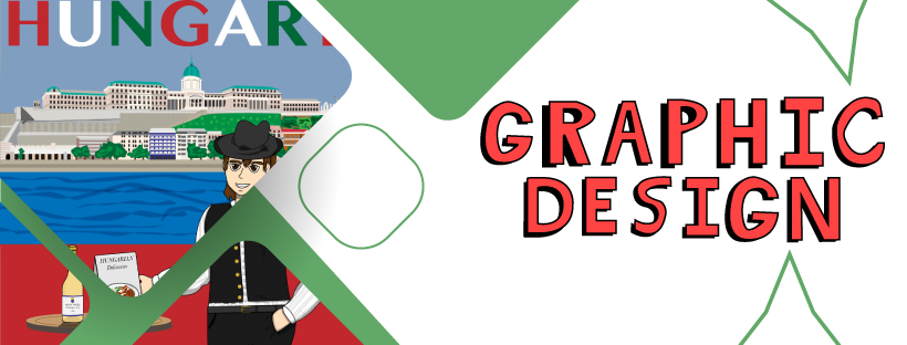
Bon Voyage to HUNGARY
The design features a character in traditional Hungarian attire standing in front of a scenic backdrop of the Budapest skyline, with iconic landmarks such as Buda Castle visible in the background. The bold “HUNGARY” title at the top of the image, using the national colors of red, white, and green, gives it a patriotic touch. The character holds a menu labeled “Hungarian Delicacies,” symbolizing the country’s rich culinary tradition. A bottle of Tokaji wine, a famous Hungarian drink, sits on a table next to the figure, reinforcing the focus on local culture and cuisine. The design uses clean lines and bright, flat colors, providing a modern yet culturally rooted aesthetic presented in a friendly and inviting cartoon style.

Necessary Voice
Poster created in Advance Design Service for Prof. Emily Larned. Tried to capture the idea of an old-style poster using Neuxas rust typography, which grabs everybody’s attention and wants to go to the event and be involved and show the big idea they have because that was the main thought and inspiration for all these events.